
Look Cinemas
reBrand
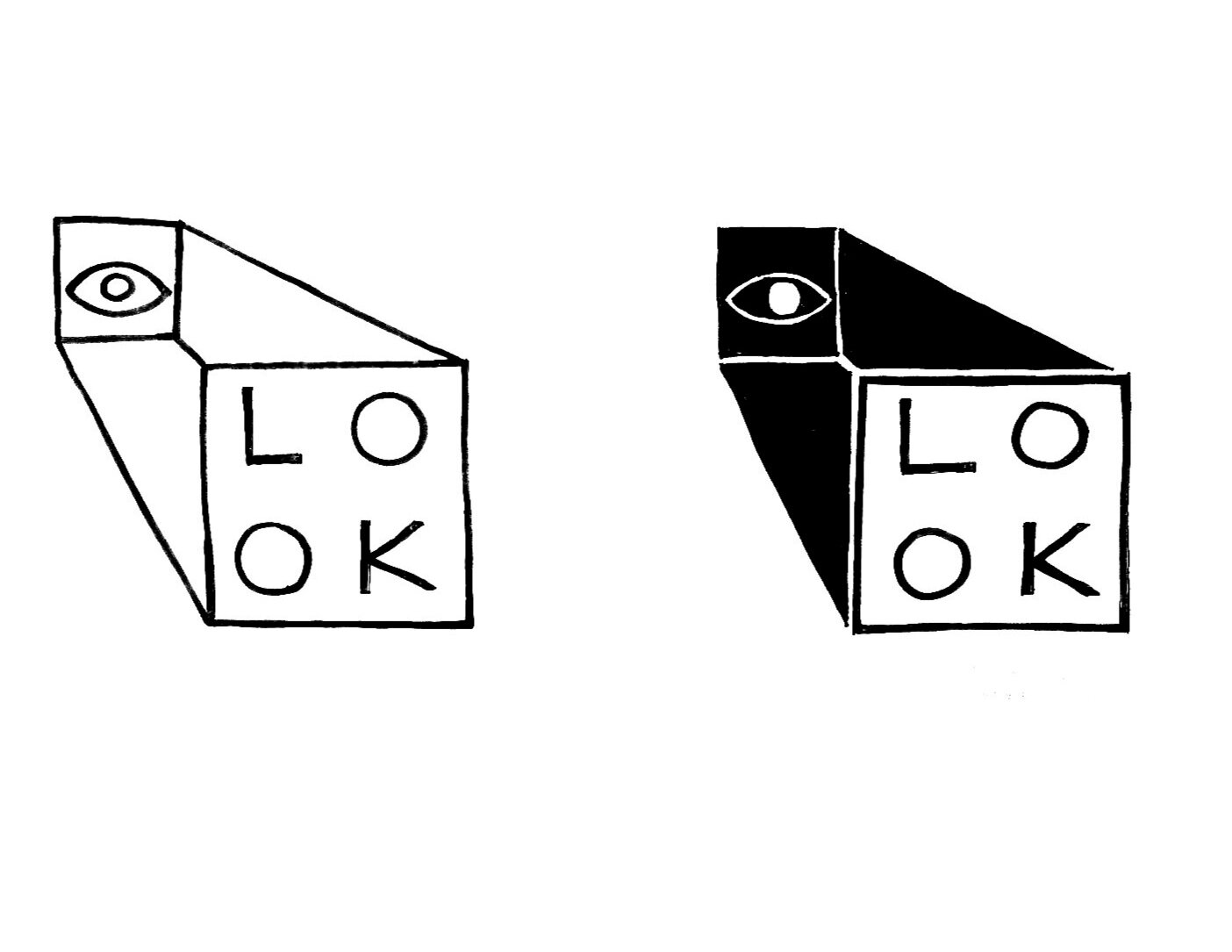
Look Cinemas is an upscale movie theater in Dallas, Texas, that provides premium movie viewing experiences. I wanted to communicate their modern, refined, and upscale voice. I created a simple logo that provided opportunities to utilize its basic shapes. Brand extensions such as stationery, business cards, and Instagram posts provide dynamic uses of the logo.


Process

Existing branding


Audience
Because of its upscale and experiential nature, the target audience of Look Cinemas might be urban, upper income individuals in their 30s-60s. I can imagine someone attending this theater looking to have a relaxing, luxurious, and fun experience after their long week at work, and to have a night out with their spouse, friends, or family. This movie-goer values relaxation and is willing to pay extra for details such as comfortable seating and higher quality food and drink options.
Objective
I want the audience to take away from the logo that the brand is modern, elegant, and upscale, with the primary focus being the advancement of the movie viewing experience. The audience should believe this message because of the value in comfort to improve the experience of watching a movie. There is importance in the brand of an upscale theater in that it invites people to keep the tradition of a movie theater experience alive and exciting during a time where streaming services are favored.


After several sketches, I decided to narrow the logos to these three variations. They are all very different, but each of them met my objective of representing film (projector, film roll, and camera).


Ultimately I made the decision to move forward with the simplest of my options. I felt that there was more potential for branding opportunities, as a logo this simple could easily be flexible.
I attempted to find the right shapes, and experimented with different typefaces that reflected an Art Deco/retro spirit. I took a risk with stylized typeface choices, but learned that the logo would be enhanced with a simple typeface that would better integrate with the basic shapes that make up the word “look”.
Software: Adobe Illustrator, Adobe Photoshop